My latest released project is focusing on Visualizing Slovenian IT tax spending (139 million euros), the idea here is to take otherwise meaningless numbers and display them visually in a way that tells a story of who is spending how much and on what. The data set comes directly from the government in semi-clean XLS file. Visualization technique I’ve decided on is treemap visualization to represent the data with different box sizes relative to each other.
Give it a try for yourself:
Launch the interactive Slovenian IT tax (in Slovenian)
While visualization itself is nice, there are a two points that you have to be careful about when releasing such visualizations to the public:
Transparency of data and data transformations
In my case, the data set came directly from the government. In order to make sure that everyone can check my calculations I’ve included links to their file as well as provided a local copy in case their version changes or disappears.
You’re loosing and reinterpreting data with every visualization. That is why it’s important to also include transformation scripts so that others can check your work and possibly build on top of it or at least make sure that you didn’t do anything tricky with the data.
I’ve opted for a github repository where I’ve pushed all the associated files: http://github.com/gandalfar/itproracun. It’s a bit chaotic but it should be pretty self-explanatory to any python and JavaScript developer.
Telling the story
Every data visualization is trying to tell a story. It might not be obvious to the visualization author but it helps to identify this early in the process.
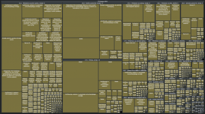
I started with just a simple breakdown based on the institutions:
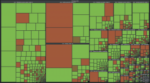
It’s very noisy and it’s hard to compare different institutions to each other. Initial comments to this were that it’s not shiny enough. Cleaning the interface up I came to the following revision:
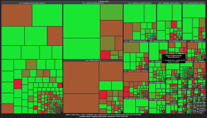
It’s much cleaner and what basically showed that I need to find an angle to this data. I decided to focus on the ratio between software and services vs. hardware and network equipment. Final version now tells a story of how police is spending a lot of their IT money on network and hardware equipment, while Tax Office is spending much more money on software and services.
Agenda of this last version of visualization should be clear to anyone who takes a few moments to study it.
Other lessons learned
Visualization toolkit should be powerful on one hand, but offer first results without too much work. JavaScript InfoVis Toolkit does this job very well. There are some interesting tidbits that are not entirely clear from the documentation, but become obvious once you start thinking how the rendering works.
The biggest time sink is parsing and cleaning up the data. Don’t expect that the .xls file will make any sense from the programmatic point of view, even though it mostly looks fine when viewed manually. Small parsing errors, moved cells and strange line breaks made parsing this data the biggest challenge.
Big thanks go the community of Slo-Tech and my brother that gave valuable feedback during the development.
I hope you’ve enjoyed this visualization. Let me know in comments what other points of view you’d like to see as well as your ideas how to further improve it.


Zdaj pa vem, zakaj se ho?e ve?ina IT podjetij priklju?it na državne jasli…
In tukajle lepo vidiš, kje je poraba storitev najve?ja. 🙂
?isto druga?e si je takole zadevo predstavljat. Super!
Beautiful visualization that puts those numbers in a totally different perspective. Keep up the good work 😉
awesome, congrats!
will we finally get a first-time-ever total state budget visualization as well? 😉
best, b
Fantastic job, Jure!
The visiualization looks great, giving an interesting insight into the allocation of budget funds. Your work confirms what everyone working in this sector knows, but doesn’t want to admit publicly: The state/goverment has been spending large amounts of taxpayers money for costly licenses instead of investing this money in open-source software, thus, supporting the R&D departments of home IT industry. Yes, there are some examples of good practice also in this field (e.g., the software that was build up for taxation evidence), but I think we should interpret them as exceptions that confirm the general rule.
As your are asking for suggestions, the first two that come to my mind are the following:
– Besides hardware-software dichotomy I would introduce a third category (following what I said above), that is R&D. If you look carefully to the budget of Ministry for Public Administration as well as Tax Administration Office you can notice they will spend a substantial (although still not enough) amount of funds for the development of IS in 2010.
– in analytical (statistical) terms, the next (natural) step would be to run a cluster analysis on this data in order to find out (statistical) similarities/divergences among different budget users.
Great work, love it.