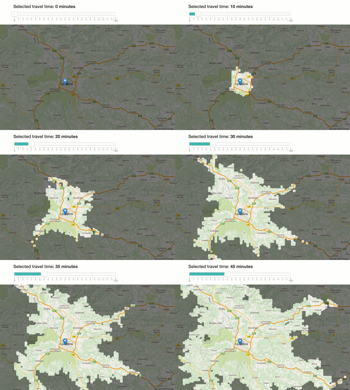
My friends are looking to buy an affordable house around Ljubljana. But what are their options, if they want to choose based on commute time? I decided to build a tool to visualise their options.
An isochrone map (isochrone plan, isochrone diagram) in science and urban planning is a map showing areas related to isochrones between different points. An isochrone is defined as “a line drawn on a map connecting points at which something occurs or arrives at the same time” (https://en.wikipedia.org/wiki/Isochrone_map)
Methodology and Technology
I’ve generated a grid of ~40.000 points in Slovenia and calculated travel time to it from a fixed point in Ljubljana Centre. Each point is displayed on a map with radius of 800 meters. It’s a tradeoff between number of points and realistic travel time with a car in a populated area.
For routing and time calculations, I used Project OSRM with OpenStreetMap database of Slovenia. A Python script connected all of this together into a static dataset for the the web site.
Lessons learned
I first coded a prototype with Google Maps Directions API. It turns out that 2500 requests/day isn’t enough to make such an application practical.
I then found OSRM and it allowed me to host directions API directly on my computer. It’s also really fast. On a single i7 core, it can do about 40 requests/second. In practice is almost as good as commercial API’s. Based on my tests, the difference of results is about +/- 5 minutes.
What is missing is traffic data. OSRM is returning travel time in optimal traffic conditions. While some of this data is openly available, I’m not sure how to incorporate it. It would also mean that the whole visualisation would need to display the time component too.
What’s next
I’d like to build a similar version for public transportation – both inside Ljubljana and in the greater Ljubljana region.
It wouldn’t be too hard to make this map dynamic – so you could select your own starting point.
I’ve also discovered that running your own directions API opens up a number of new possibilities. One of them would is potentially adding a layer of routing to Prevoz.org so we could calculate travel time and also suggest rides that pass through your city.
Do you have any ideas?
Let me know in the comments.
I now also have a newsletter so you can be notified when I release something new. Subscribe to it now 🙂.

This is brilliant, but why are there isolated spots on the map? As Earth surface can be seen as a continuous plane this is mathematically impossible 🙂
I think traffic data is really crucial. For example 5-10 minutes map is crazily optimistic, but 35 minutes is close to accurate. Where would you get traffic data?
As I am also thinking of moving I would welcome such service greatly. If I could also layer with other information like available internet bandwidth etc. then it would be even better (worth paying for).
I’m not from Ljubljana. I vote for dynamic point of destination.
Marko: I think the spots are there due to the sampling error. 800 meters is stil large enough area to make the travel time longer.
I know DARS publishes some of the traffic data, but I would have to find a way to include it in the directions API.
David, Marko: thank’s for supporting the idea of making this a service.