At DrupalCon, Leisa and her team introduced their efforts to redesign drupal.org page. They want to make it a community driven process where all the existing and potential users can give input at all the design stages.
The latest step in this effort is her invitation to the community to send in wireframes and sketches of our ideas.
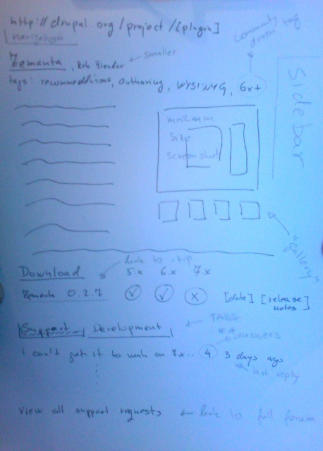
Here is my effort, done fast and rough, as these things by definition should be done. I went to re-sketch Drupal module page for Zemanta Drupal module as this is something I’m involved with professionally and it bothers quite a lot.
First the wireframe:

There are two basic ideas behind this wireframe:
- make it more visual by adding image gallery and screenshot as integral part of the page
- downplay the fact that it’s a developer thing and make it easier for end-users.
Going from top left downwards:
- the title is made prominent, with author name next to it, but much more discrete
- folksonomies bellow the title, with possibility that it’s driven by the trusted community and not just authors themselves. Uses like tag Works7x, or similar could then emerge
- The description text is then presented around the image gallery
The design behind this part should be tight in order to fit all the catchy information within one screen, without scrolling and help “sell” the author the modules itself.
Below this description area, there is a new section – Download, which is a quick call to action, find the module that works with your Drupal installation and download it now. Release notes and release dates are there to provide extra information of any special requirements and to see how fresh is the release.
The third section is support/developer part. In current release one can’t easily see latest issues without going to a separate page.
This design does following things:
- Visually separates support and developer sections in order to not confuse end users with developer things (patches, etc.)
- Provide a short list of latest support issues, together with a link to a full support forum sub-page (the same as it’s done now)
- The developer tab works the same, it just visually changes the <div> and presents the developer information
- This section possibly needs some sort of legend on top of the table
It’s also important to note the things I removed:
- No more authentication stuff on this page. There is no “create new issue” link here, as we want to drive people to full support page in case the last few answers don’t help; auth is done from there
- The documentation and homepage are downlplayed; they can be mentioned at the end of description if required from the author
Other ideas:
- It should be possible to disable support forum and dev forum on the page and drive to alternative location: either author forum or places like getsatisfacition. Drupal could then just read some sort of standard RSS feed of this information.
- Reasoning behind previous points is: some companies (like my company) have a number of different modules and they don’t want to scatter their support resources around the web. Alternative reason is that for some popular modules advertising on their forums/support pages is actually substantial sources of income and drupal.org could help drive the traffic towards original developers
- Being able to group modules into arbitrary groups could be a neat feature. It would work in a way that one could create a group of “e-commerce necesseties modules”, and then list all the modules one should download in order to have the optimal/initial set of modules for such task.
![Reblog this post [with Zemanta]](http://img.zemanta.com/reblog_e.png?x-id=0ea0ae85-3e8e-4e36-a1ed-157e65b10c1d)