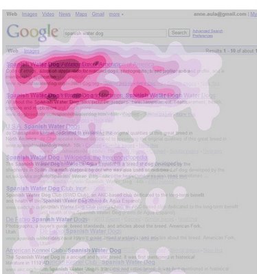
You’ve probably seen the Google Eyetracking blog post that’s been published on their blog and shows this Image of how results are interpreted by the reader:

What’s interesting with this image is the usual – the thing that we don’t see – heatmap for adveristing part. Does our advertising stand a fair chance of being evaluated?
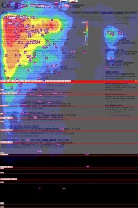
A bit of Googling around uncovers the following heatmap of full window, where you can actually see also advertising elements evaluated:

We can see that while the top two/three results get most focus, tend subject in this image also decided to see if advertising was useful. Too bad they only looked at first ad, just quickly glancing at the second one.
The big question is once again – is anyone doing any serious Eye Tracking in their work, and why not?