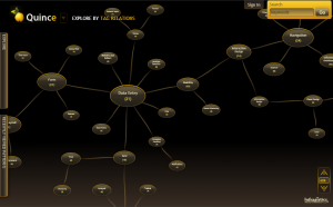
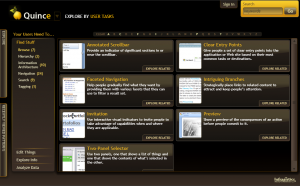
Being subscribed to a million of different obscure mailing lists and blogs has some advantages. Every once in a while you grab announcement of a rare gem early. Today I receivend an email about Quince – A UX Patterns Explorer by Infragistics.
It’s a visual representation of some of interface patterns used in interface design field. Idea behind these patterns is that if we manage to standardize on certain ways of doing things, then the overall usability and user experience of your interface will benefit from it.
So the big problem is – how do I learn patterns? The usual way in * design profession is that you observe the world around you, take note of remarkable work of others and observe the problems of your users to iterate to a solution.
The other approach is to dive into one of these pattern sites, see how others solved similar presentation/navigation/input/ .. problem and get inspiration from it. Quince is one of such solutions.

It has a wide collection of different patterns together with examples, rational and screen shots. All neatly organizable and browsable. It also allows community to add and vote for their own so it has potential to grow with time.
The bad? It’s done in Silverlight and has a bit confusing User Interface. But it seems to work nicely on my Mac for now and I plan to evaluate it in my future interface design.

And for the ones wondering – Quince is a very nice flower of Asian origin:

![Reblog this post [with Zemanta]](http://img.zemanta.com/reblog_e.png?x-id=6f2c524c-6b62-4510-8af7-079d427fc20e)
Thanks for giving credit!
Quince (fruit) makes delicious jams.
Do you have any tips on UI design pattern books (or sites that don't require evil tech?)
For development, I find that design patterns really help structure how I tackle a problem. Wouldn't mind a bit of that clarity for when I dabble into UI stuff…
TIA!
Na sliki je japonska kutina, ki je samo okrasna rastlina, njeni plodovi pa so neužitni. Medtem, ko je prava kutina res dobra za marmelade.