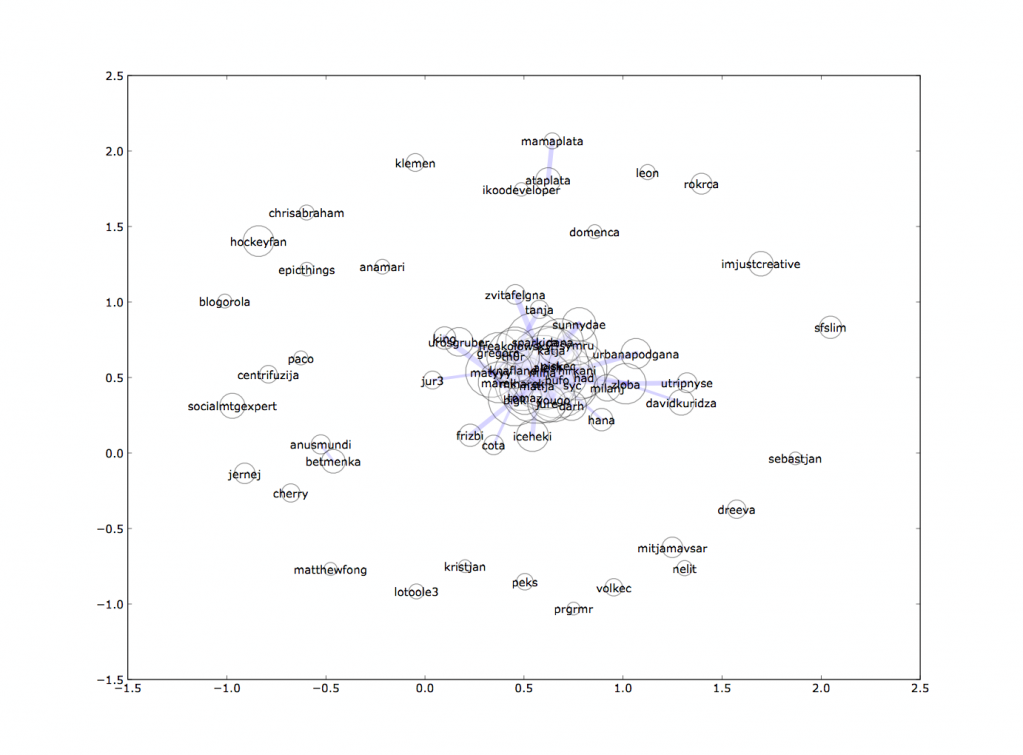
Continuing my saga of visualizing Koornk social network I decided that obvious next step is to map out who talks to who and how much. For this task I used excellent Python library NetworkX that uses pygraphviz to draw the pretty pictures in the end.
Just to explain what you’re looking at:
- I downloaded all public conversations from Koornk and filtered out to the ones that use @ somewhere to reference someone else
- You need to all-together reference or be referenced 60 times to get on the list (70 people from 1606 made it)
- From those 70 people, if two of them talked more then 40-times they got a line between each other
- Line thickness is then calculated based on how much they talked to each other
- Circle size around each person tells you their cumulative chatter towards others
Fun statistic: about 22% of all message looked at (N=81990), contained @ reference
Pretty pictures

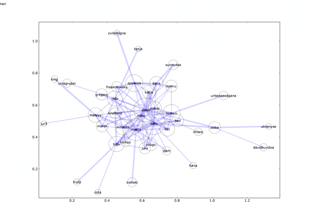
It turns out that there’s a smaller group of very vocal people within this view, so we naturally want to see zoomed version:

Lessons learned
- It takes about two days to properly get a hang of NetworkX library to draw something like that. It doesn’t mean you know anything about graph theory, but at least you can start drawing pretty pictures.
- Pictures are fun, but next step is probably interactive Flash diagram that allows you to explore these relationship for yourself
- Throwing around these data structures actually takes a few seconds on modern PC. Finally something meaningful for it to process.
- I wonder how much work would be to properly plot something like this for a subset of Twitter relationship if I maybe drink from their fire-hose long enough. Maybe Gnip guys can fill up a few Terabytes of Hard Drives with back log, if they have it and we start crunching this. (I’m assuming that there’s already a post-graduate student somewhere that’s doing exactly this)
![Reblog this post [with Zemanta]](http://img.zemanta.com/reblog_e.png?x-id=816408bd-1031-4732-814a-d3ff0aa562cc)
woow, pretty fcuking amazing 🙂
Now I really can see (I'm a very visualised person) that I talk too much. Thanks Jure 🙂
Amazing.
I have just found out who interests me most in Koornk.
Yeah!
Nice one and I can only add “Picture tells more than 1000 words”
Jure – we're still working with Twitter to find a way that they'll be comfortable with us passing full data to people. For now, they prefer that you go to them directly to get their data (subsequently forcing you to write your own poller) rather than get their data via Gnip. Fingers crossed!