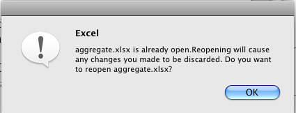
Modal dialogs are something to be very careful around as they break the flow of user interaction and scream at user “Focus! Answer this NOW!”
But what do you think when you get something like this:
I imagine it would be too much to build a QA tool that would scan all the dialogs and detect if they end with question mark (or if you’re really smart – use natural language processing to detect the question form) and notify someone to take a look at what’s happening. One can dream ..
Have you seen any interesting dialogs recently?


WOW what the heck is that? 🙂
Did it happen on MS Office 2008?
Yes. I'll patch it a bit now though, so hopefully these errors go away 🙂
I've never in my life seen an interesting dialog box. Hell, I'm a developer and never read them just guess what button I want to click to continue with what I'm doing.
Sadly this has often led to accidentally dropping too many tables or something out of a database, but hey, backup. And I do think many of these dialog boxes could be dealt away with by software having a revision system in place so you can just rollback if you screw something up.
Dialog boxes are evil.
Well, it doesn't seem rhetorical to me. When I get it there is an option to click “X” to close it. This is very useful when there are many windows/tabs open and you forget that that you are already working on this document and want to keep the changes.
Although, I don't see the X on your screenshoot … Is it cut out or there isn't any?
There is any 🙂 OS X doesn't have and X on Dialog boxes 🙂
I've often wondered about the use of single-button dialog boxes (regardless of the text being a question or not).
If you're not giving the user a choice, why notify the user? It's not like he/she can do anything about it with a single button. If it's something important, give the user a choice to avoid the outcome. If it's not important enough to warrant a choice, you might be better off notifying the user via a status bar (or notification popup, but we hate those too). Jure, what does your usability-expertise say on this?
On interesting dialogs, this: http://alextreme.org/gfx/verpl_of_kopieren.png IE dialog is probably as good as I get them (Dutch: Do you want to move or copy files out of this zone? Buttons: Yes / No). It's probably due to a sloppy translator though, not a logical error by the developers themselves.
On the QA tool: perhaps it's simply a better idea to just add a new line to your QA guide to check all dialog boxes for logical questions? I'm all for NLP, but there are likely to be other problems with dialog boxes beyond this example.