As we already know, some of us are seriously addicted to Twitter, which is for us totally ubiquitous now. We’re tweeting at all times of day and organize most of our social life with this nifty little tool. Even more, in order to separate our audiences, some of us are using a number of different services.
By building a body of Tweets, we can then become vulnerable to different visualization techniques to inspect our usage patterns. Latest one is a service Twitter Charts.
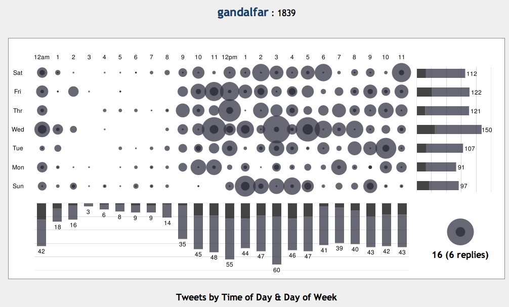
Here’s output for my Twitter:
It says for example:
- I tweet most in the second part of the week
- If you’re waiting for my reply, it’s most likely that you’ll get it after lunch (CET timezone), or just before I go to sleep
- I’m hardly ever awake on Sunday before noon
- I believe that 4am tweets are anomaly in the system and are from the times I was in USA, and make sense in grand scheme of my tweeting patterns
- lets tweet together on Wednesday!
Now you go try it, and let us know what it tells about your social behavior.

![Reblog this post [with Zemanta]](http://img.zemanta.com/reblog_e.png?x-id=bbc4ffbe-7fd9-4cad-a6d1-87f2bfec8d0d)
Apparently I mostly tweet before and after work and before and after lunch. Also for some reason mostly on Wednesdays, same as you
Apparently I mostly tweet before and after work and before and after lunch. Also for some reason mostly on Wednesdays, same as you
Thank you so much for not only this tidbit, but all the others I've read from you since I started following you on Twitter and on your blog!What's the proper name for the chart images shown in Steve's post? With the dots that represent different sizes… I'm not aware yet. I think it's a type of “bubble chart”. 🙂