Today I stumbled upon neat new tool called RescueTime. The idea behind it is that you install a small application on to your computer and it would track everything you do, which sites you spend most time on, what applications and such and display you nice little statistics about it later, so you can “rescue/reclaim your time” back. Idea seems similiar to the one of Wakoopa, but at least is not trying to sneak new social network into my life.
The purpose of this text is to show some reflections of what my first few minutes in setting up their software were like.
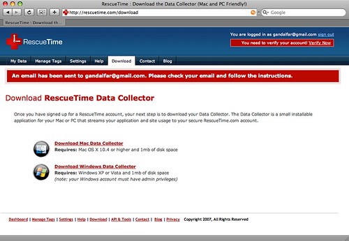
Their login process was a very enjoyable one, and in a few short moments they presented me with a following screen:
This is the first screen that I saw after pressing register button. It automatically logged me in, showed me a nice warning about email verification (not sure why they need to do that), and then immediately gave me something to do: Download the client. Since it is more then a few kb in size, it was something nice to add to background downloads while I was battling with the next email screen:
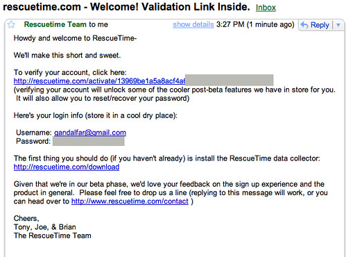
Here RescueTime sent me back their e-mail verification, together with a password that I just entered in a clear text format. In my views this is a major breach of my confidence in them since they are telling me that they actually don’t encrypt my passwords and the first hacker that comes by is going to get my clear text. While this might not be the technical case, it is something I always get a feeling. I also dislike getting clear text passwords back into my Inbox because of all the indexing and the fact that now they are out in the open.
The other thing that did not work for me, is their activation code. I’m still not sure why they have to be so long and complicated, and in a good way to break into two lines in some e-mail clients.
While I was pondering abou these things, I manged to click the verify account link and found myself infront of a nice screen telling me that I am now a happy activated user:
So it looks like everything is in place and that I should install the client, which I happily do. It asks me for my username and password (which I happened to enter wrongly) and continue using application. Every once in a while I refresh the above page to get a message that I’m still too new to get any data, at no point it does not communicate to me that my client has not managed to connect to their servers.
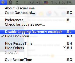
After about an hour I start investigating the fact that they still do not track my data further. Their top menu tools like:
Their Disable logging screen actually made me think for a while that everything is working ok, and that I’m just being impatient. Currently enabled text told me that logging is working, which to me implies that communication to server is also working.
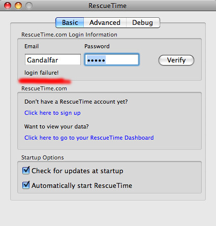
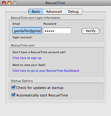
Luckily I decided to dig deeper and discovered a screen that I was presented with once before, with a helpful verify button:
Notice the underlined login failure text. The major breakage in making their whole service work is written in a small, unnoticeable text. Since I was playing with the client while chatting with a couple people and trying to multi-task a few things I managed to press it a few times and each time, I was convinced that it succeeded since it did not pop out something yellow or red with exclamation mark.
In comparision how the screen looks after I finally figured out that they are not using my normal username, but my email as username:
For practical purposes of compulsive multi-tasker almost no difference.
There is also an issue with the fact that they want me to sign up with their service, even though it just verified that I already have a valid account there. I’d much prefer to see some fun statistic in that area, something in range of: “Fun fact: in last three days you spent 3h and 15min chatting on Adium!” and then below how to see more in order to give me a bit of a taste of what I am clicking on and prepare me with a warm and fuzzy pre-feeling to a full website experience.
After this thrilling experience of playing detective in order to figure out where the application failed to communicate to me I actually ran our of time/energy in order to play more with the actual web site/service, so I will leave this for some other day.
Short recap
What I hope to learn from observing this application is that:
- in case your main communication channel is down, you have to scream it loud to the user, other he probably will not notice and will forget about you
- clear text passwords in emails give me sense of bad security practices of sender and not respecting privacy of my email
- giving a small cookie to user to see what you are offering behind the link might help with actual click-troughs
Overall I am happy that I managed to find enough energy to actually install the application, because the overall experience was not too bad.

Some excellent points here. Thanks for the feedback.
I totally agree on the clear text password issue. It’s a carry over from our very small closed beta and should’ve been fixed before we opened it up.
We need to make the client a touch smarter about knowing when communication is occurring and when it’s failing.
But hey, it’s beta– we’re working on it! 🙂
By popular demand, I have now removed the cleartext password email *feature*. 🙂 Thanks for the write-up!
Like the new message in the password field:
“Password: As IF we would send you your password in cleartext!”
Roman Gonzalez: yep, much cooler =)
No go for RescueTime – I was interested but when I got to know that is online – then I lost interest!